Photo Story–A Mother’s Journey

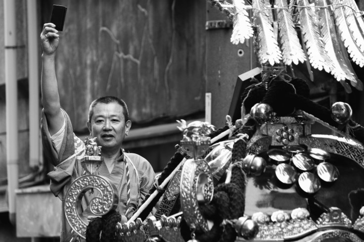
If you read newspaper a lot, you may notice that there are several different editing choices when it comes to photojournalism. An photo editor has to decide either to use one giant facial close-up picture or 5~7 photos shot from different angles with different sizes.

There are some common rules for photo editors when they have to choose which photo to use, which not to.

  1. Lager images draw viewers’ attention and show more details, which can increase the number of readers.
  2. Running different sizes can add contrast and change the pace of the story.
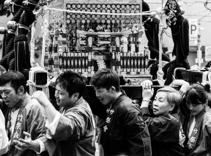
  3. Pictures in pairs: Don’t use 2 or more pics when one can sum all up. But when pics complement each other, 2 or more pics will say more about the story.

Here are 2 major different types of photo editing for newspapers or magazines. One is photo story, one is photo essay.

Photo story is defined as visual narrative with beginning, middle, ending. Images are interrelated with each other.

Photo essay explores a situation and expresses a point of view. Each photo makes its point, and together they make a larger more significant statement.

Today, we will talk about one of my favorite photo stories (a multimedia project)–A Mother’s Journey.

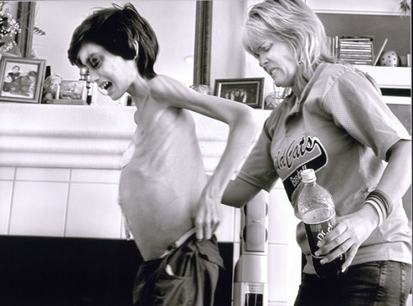
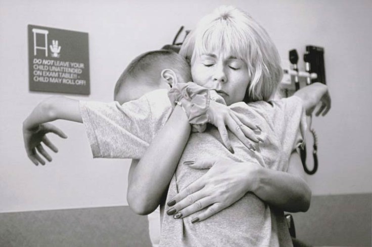
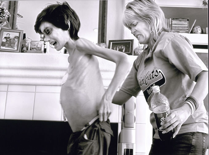
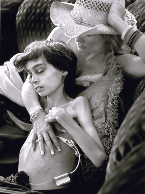
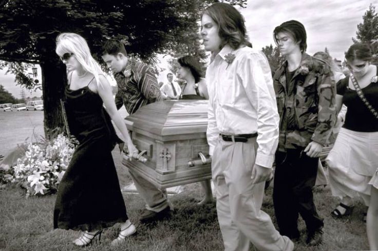
A Mother’s Journey is a documentary photograph work started by Renee Byer in 2015. It recorded the final days of a tumor patient Derek Madsen and how his mother Cyndie French spent the rest of his days with Derek.

1
Cyndie French, embraces her son, Derek Madsen, 10, on July 25, 2005, after learning Derek needs surgery to remove a cancerous tumor in his abdomen. The emotional impact is taking its toll on her. “How can anyone maintain a nine-to-five job and do this?” she begins to wonder.

This project has won the 2007 Pulitzer Prize for Feature Photography. The Photography Channel helped to make a multimedia piece, including Renee and the mother’s interview.

4
Shortly after his 11th birthday and Cyndie’s 40th, Derek is comforted by his brother Micah Moffe, 17, left, and mom Cyndie, right, as he gets a tattoo in preparation for radiation therapy on November 30, 2005. Micah often accompanies Derek to treatments even though his schoolwork suffers.

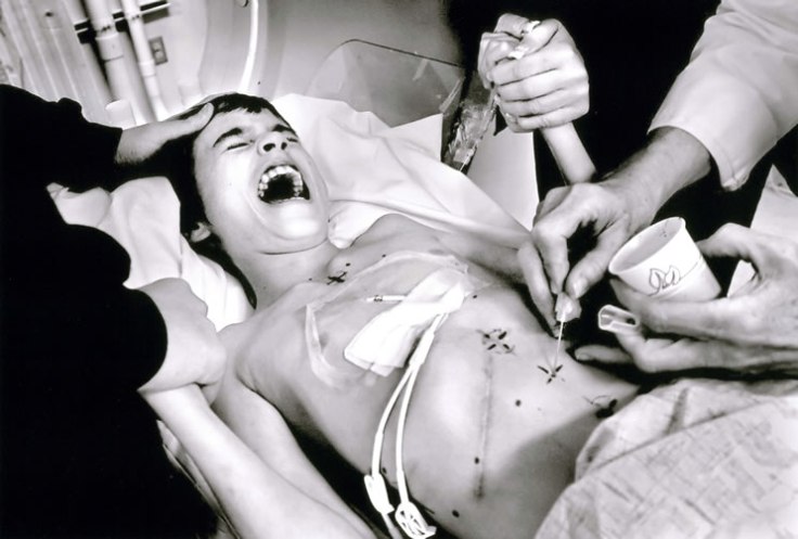
Cyndie is a single mother of 5 children, and she quitted her job after Derek was diagnosed a cancerous tumor in his abdomen in 2015 when he was 10. Cyndie tried everything she could to comfort her son.

11
Derek has a final burst of energy after days of Cyndie keeping vigil at his bedside. She helps her anguished son walk on April 26. A cancerous tumor has distended Derek’s stomach so far that his pants no longer fit. Another tumor in his brain impairs his eyesight making navigation difficult inside their rental home.

The interview of Renee’s is basically her telling stories behind these images, their conversations and their feeling at that time, which strikes a chord with the viewers and amplifies sadness of whoever is watching this.

15
Cyndie holds Derek on May 8. He is on medication that hinders his speech and keeps him awake at night. Except for a few minutes while hospice nurses are with him, Cyndie spends nearly every moment of the day at his side. “I was exhausted beyond belief but I had to do this. He would call my name and always expects me to be there,” Cyndie said.

This is a well established example of multimedia, including interview audios to enhance the impact of still images. It would be better to include interviews of Derek, if he wanted to share his thoughts. From the story telling perspective, I do want to know more conversations or even quarrel between Derek and Cyndie, environment sound in the hospital, etc. But we all know, that this is a heart wrenching story, and we all should show our respect to Derek and Cyndie.

19
Cyndie leads Derek’s casket to burial with assistance from her sons Anthony Moffe, foreground, Micah Moffe, opposite him, and Vincent Morris, who is not visible, as well as several friends. “I will forever carry your memory in my heart and remind others to give of their time, energy and support to other families like ours,” Cyndie says at the funeral. Derek was buried in Mount Vernon Memorial Park in Fair Oaks, California, on May 19, 2006.


Gestalt Law

Gestalt Law is widely used in spheres like art, design, commercial, photography. It’s all about how our eyes and brain perceive a unified shape in a different way to the way they perceive the individual parts of those shapes.

The law can simply be summarized as “the whole is more than the sum of all parts”. For example, take a look at the following picture, some kind of visual games we’ve played since children.

At first, you may see an old couple’s heads, however when you look even more carefully, you may notice there are two men sitting at the face parts and a woman at the old man’s ear part. This picture shows us how Gestalt Law works, and how our eyes group images as a whole.

There are 4 basic laws of Gestalt: proximity, similarity, continuity and closure.

  • Proximity: close elements tend to be seen as a group or pattern. The smaller an area of space is, the greater possibility it will be perceived as figure (figure-ground relations).

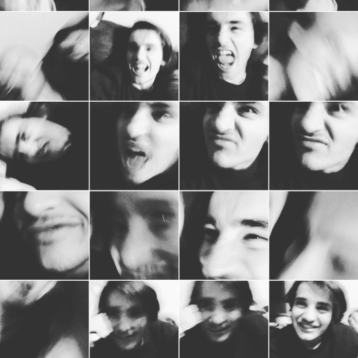
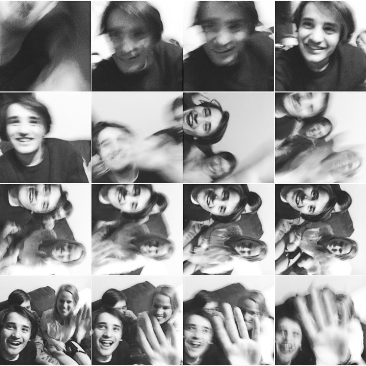
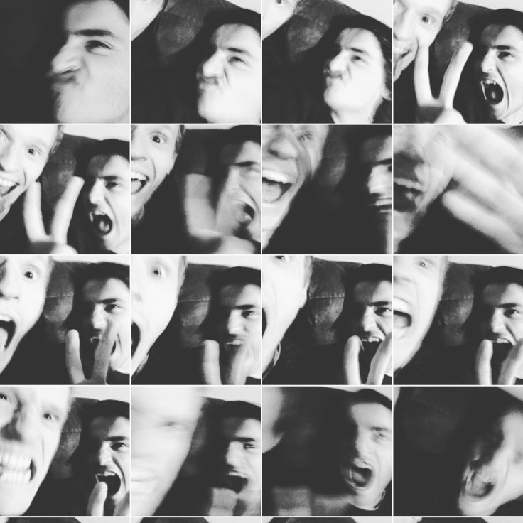
When the little black squares are placed randomly (without proximity), they are perceived as separate images, no particular meaning. However, when you place all little squares together orderly (with proximity), although they are still separate from each other,  they can be seen as a group, which combines them to a big square.

  • Similarity: similar visual elements(shape, color, size, movement) tend to be seen as related and therefore grouped.

Look at the right image, your brain will automatically process that each horizontal row as a group because they are all black or white (similarity).

  • Continuity: visual elements that require the fewest number of interruptions will be grouped to form continuous straight t or curved lines.

This is a little bit hard to comprehend, but if you look at the following examples, you will understand what is continuity.

The picture on the left, if you see a black dots line like this, guess which red line (① or ②) will continue the black one. Most of us will answer line ②. Why? Because perceiving line ② as the continuing path would be easier, as we said that it requires the fewest interruptions or changes. The same theory can be applied to the picture on the right. Perceiving an “X” as two straight lines is easier than seeing two arrow marks. The latter requires more visual changes, which our brain doesn’t like very much.

  • Closure: incomplete figures tend to be seen as complete. When a part of a picture is missing, our visual perception will fill in the blank.

屏幕快照 0029-09-06 15.47.58

I didn’t find a proper example to show this, but as you can see the WWF logo, there are no lines around the panda’s head. It’s just black and white spots. However we perceive it as a panda anyway.

Another theory about closure is that areas with closed contours are more likely seen than areas with open contour. The batman poster explains a lot.

Okay, we discussed the Gestalt Law and some cases. The law is actually used wildly in our daily life than you can imagine, such as some famous company logos.


Composition Tips from Steve McCurry

Steve McCurry has been an icon in contemporary photography, as a National Geographic Magazine photographer.

After graduating from Pennsylvania State University, he got employed by a local newspaper The Daily Collegian, where he started his career as a professional photojournalist. After several years domestic experiences in photoj, he left for India to freelance. Then he boosted his career there, as a freelance. He is best known for his 1984 work, “Afghan Girl“.

Steve McCurry, 1984, National Geographic Magazine

The 12-year-old girl Sharbat Gula, was studying in a refugee camp on the border of Afghanistan and Pakistan when this photograph was taken. Her parents were both killed in an Afghan village during an air attack by Soviet.

People always associate this picture with Leonardo da Vinci’s masterpiece Mona Lisa, because of her unfathomable eyes. Her eyes conceal tremendous sadness but at the same time you can read courage and determination. The contrast between her crystal clear eyes and slightly dusty face and her worn-out clothes, shows her sufferings and strengths.

What is important to my work is the individual picture. I photograph stories on assignment, and of course they have to be put together coherently. But what matters most is that each picture stands on its own, with its own place and feeling.

Humanity is always what he seeks for. Depicting profound stories out of ordinary people is the assignment for each photojournalist. But beyond that, Steve has taught us how to utilize composition to be a good photographer.

Here are some composition tips to shoot gorgeous pics.

  • Rule of Thirds

The guideline proposes that an image should be divided into nine equal parts by two equally spaced horizontal lines and two equally spaced vertical lines, and that important compositional elements should be placed along these lines or their intersections.

intersection points
Place important elements along the lines
  • Leading Lines (Radii/Diagonals)

Use natural lines to lead the eye into the picture. It usually starts at the bottom of the frame then lead the eye upwards and inwards. You can easily find a leading line from roads, walls, railways, etc. It generates a feeling of motion, and the lines often meet each other in a vanishing point.

Railway leading lines
Vanishing point
  • Natural Framing

A natural frame can direct the viewer’s eye to what you want to show, also can add depth and dimension to your picture. You can use windows, doors, anything as a frame.

Each window frame tells a story
Use natural circles and squares
  • Patterns/Repetition

Patterns can emphasize your subject and show the size and scale. It’ll also bring impact to the viewers. Patterns can be found in flowers, grocery store, basically it exits in your daily life. But breaking the pattern will enhance graphically appealing.

Monks with the same clothes show great pattern
Use contrasting colors or different size to break the pattern
  • Symmetry

Symmetry is pleasing to the eye because it shows perfect balance of an image. And visual balance brings a certain stability and harmony.

Move your legs to find the symmetry point

Above are just a few tips to improve your works, there are more rules like texture, scale, contrast, light, angle, layer, decisive moment… etc. As Steve puts it, enjoy yourself and photograph in your own way and your own style.

If you’re interested in photography, go out and practice as much as you can. That’s the most important rule.

Observations about World Press Photo Contest 2017

報道写真の編集者にとって、写真を選ぶ際に4つの基準に従うべきだと言われている。それは、情報的(informational)、グラフィックアピーリング(graphically appealing)、感情的(emotional appealing)、親密性(intimacy)だという。

報道写真にとって、最も基本だが一番大事なのは、やはり情報を伝えること。いかにニュース報道を5W1Hに従い、写真を通じて事実を全面的かつ客観的に伝えることが鍵だと思っている。スポットニュース部門で大賞を輝いたAP通信のロシア大使が暗殺された組写真を見ると、被害者であるロシア大使や暗殺者である警察官、現場にいる市民など、あらゆる角度から物語を描いていることがわかった。


屏幕快照 0029-08-24 00.30.57.png
An Assassination in Turkey by Burhan Ozbilici


さらに、今回の受賞作品を見てみると、紛争、難民、麻薬、性的少数者、貧困、疾病などをテーマに、それに関連する情報を写真という形で世の中に発信していることがわかった。今回の写真展において、大きなテーマとなっているのは難民問題だ。そのきっかけは、2015年9月にロイター通信が報じたアイランというシリア少年が難民の家族と地中海を渡ろうとした際に溺死した一枚の写真だった。その後、SNSで大いに拡散されて世界に大きな衝撃を与えた。スポットニュース部門の地中海難民の話を見てみると、同じテーマを描いた『海は燃えている』というアカデミー賞受賞作のドキュメンタリー映画を思い出した。

屏幕快照 0029-08-24 00.38.26.png
『海は燃えている』公式サイト

北アフリカから逃げ出した難民や移民は地中海に位置するイタリアの小さな島を経てヨーロッパに逃れていく話だが、途中で亡くなった人が多いという。映画で、島の住民と逃げ込んだ難民は同じ島にいるにもかかわらず、互いに接点のない暮らしをしていることを描いた。難民に無関心の人や国への反発といえるだろう。2016年、日本政府に難民認定の申請を出した人の数は1万人を超えたのに対し、認定されたのは28人しかいない。G7先進国の中に一番少ない。日本では難民のことがあまり知られていないかもしれないが、報道写真の役割の一つとして、知られていない情報や事実を世の中の人に知ってもらうことが挙げられる。今、世界各地で紛争や不公平など様々な問題がまだ起きているが、フォトジャーナリストにとって、写真をメディアとして何を表現したいのか、何を伝えたいのかをきちんと考えないといけない。

屏幕快照 0029-08-24 00.45.17
They Are Slaughtering Us like Animals by Daniel Berehulak

人の外見と同じように、絵的に綺麗な写真のほうが人目を引き寄せる。そうしたら内面に気になる。綺麗な写真を撮るには、構図や色、光、動き、表情などの要素を考慮に入れ、うまく組み立てることが必要だ。授業で光を観察しろとずっと言われているが、光があったからこそ色ができた。絵画などの歴史は色彩の歴史を言われているので、いい写真を撮れるにはやはり光をうまく使うことが基本だと思う。フィリピンの麻薬戦争を報じた報道写真家は、光や色を巧妙に使い、深刻なテーマとともに衝撃を与える写真ができた。さらに、色について、情熱の赤や憂鬱のブルーなど人の感情を連想させる機能も持っている。色によって、見る側の感情を煽ることもできる。個人として、モノクロの写真にもすごく気にいているが、それは色を除いたら被写体の表情などのディテールに気づき、より共感できると思っているからだ。もう一点気づいたことは、人物部門の写真には環境ポートレートが多いこと。周りの環境を入れることによってストーリーが補完できると思う。

屏幕快照 0029-08-24 00.50.13
Henry Gray, rancher by William Albert Allard

アメリカ写真家のWilliam Albert Allardは、周りの環境でその人のストーリーを語ることとして有名だ。その人の住むアパート、働く環境、行きつけのバーなどバックグラウンドだけがその人の人生を語られると思う。しかし、故意的に写真に入れることを選ぶと事実を曲げることができるかもしれないので、フォトジャーナリストとして嘘をつかないように注意しないといけない。さらに、編集技術で色を変えたり、トリミングしたりもできるが、本来の事実を変えたらジャーナリズムでなくなるので、写真ジャーナリズムのモラルを守らないといけないと思っている。

続いて、感情と親密性について触れたいと思う。見る側に被写体とのリンクを共感させるには、人間性のものを見せてくれる。人間性の溢れる写真は、私にとって一番感動的な写真である。今回の写真展について、率直な感想は悲しみや恐怖、憤りの感情が多い気がする。落ちた飛行機にニュースバリューがあると言われているからだ。もちろん、衝突や不幸などが大きな衝撃を与えるため人の心を掴みやすいが、しかし喜びの一瞬を見たい人もいるかもしれない。ゲートキーパーと言われるジャーナリストは読者にどのようなストーリーを届けるのかも考える必要がある。

b_illust_49_1S       b_illust_49_1S

青果加藤商店

家の近くに「加藤商店」という青果店がある。

毎日通りかかっているが、今までまだ一度も訪れたことがなかった。今日、会田先生の課題も兼ねて、店にちょっと取材に行ってきた。

85年以上の歴史を持っているとオーナーの加藤さんが言う。自分が三代目で、おじいさんからお父さんに、お父さんから自分へという。独特な素材でできた赤い帽子に、リラックスと書いている黄色いエプロンが加藤さんの特徴。

xin2
夫婦2人で支度

xin5

一見、強面の加藤さんだが、実は原宿駅前で面白い眼鏡をつけて芸をやっているらしい。

xin1的副本_MG_1968
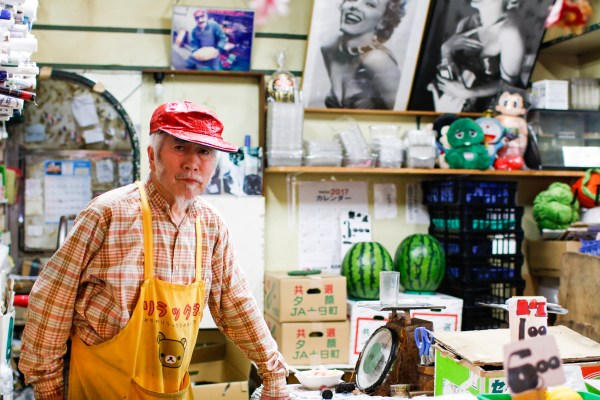
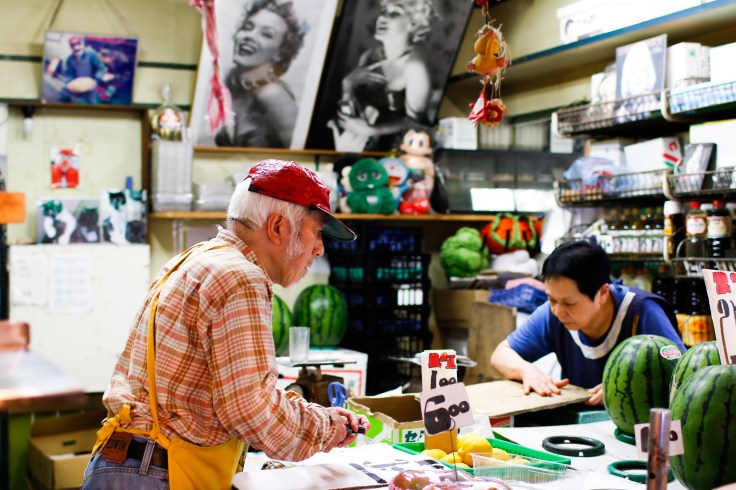
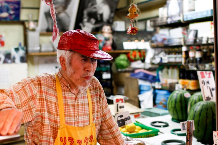
店に入ると、すぐ壁に飾ってある女優マリリン・モンローの写真が目に入る。モンローが大好きだという。左の棚になんと、全部モンローのポスターだ。(チラシ一枚いただきました。)

_MG_1969常連さんも多くて、いつも和気藹々な雰囲気で挨拶を交わしている。

xin3xin4
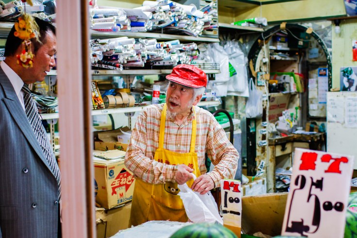
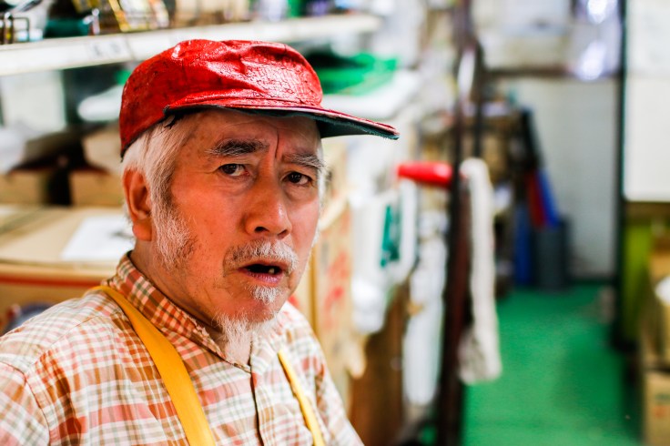
加藤さんの最強ランキングtop5。石原ちゃんが見事に一位に輝いた。僕の一位は桐谷美玲ちゃんだけどね。

_MG_1964
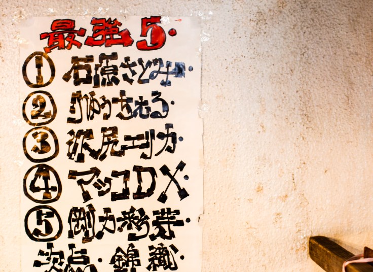
いつも不機嫌に見えるけど、実はすごく面白くて心優しいお爺ちゃんです!ぜひ、「加藤青果商店」に一度足を運んでください。素敵な店です。

xin1


熱海へ

b_illust_117_0L

ビデオはこちら

今年の2月、大学のクラスメートである蘭ちゃんと熱海へ行ってきた。大学卒業後、本社が埼玉にあるウェディングに関連する会社に入社し、結婚式場のアシスタントや恵比寿にある自社のイタリア料理店の店員など、様々な場面で活躍してきた。しかし、今年の5月から、上海に支社を立ち上げようという会社の経営方針があったため、上海に異動することになった。二度と日本で働くことがないかもって本人が言った。で、最後にどこかに一緒に出かけようと誘ったら、熱海に行くことになった。

_MG_9951

_MG_9965

結局、熱海は思ったほど面白くなかった。草津で桜が満開のニュースを聞いて、そのまま伊豆半島の南へ向かい、草津へ出発した。今年の一番早い時期で桜が見られて、有意義な旅となった。

_MG_9969_MG_9737

_MG_9970_MG_9982_MG_9986

ドキュメンタリー:Sleepless Tokyo

screen-shot-2016-12-15-at-11-00-52-am

ドキュメンタリー入門の授業で作ってみたドキュメンタリー作品です。大都市の問題をトピックとして、今回は初めてナレーションなしで挑戦しました。でも、この作品を最後まで仕上げたのが順風満帆ではなかったです。

最初の企画として、「Sleepless in Tokyo」と名付けました。あの有名なトム・ハンクス主演の人気映画「Sleepless in Seattle」(めぐり逢えたら)を借りて、東京にいる眠れない人たちの実態を調査するという企画でした。なぜこれかというと、様々な問題を調べていくうちに、大都市では睡眠時間が極めて短いこと、その中でも東京が世界で一番短いことを知ったからです。そして、インタビューなどの取材を通して実態調査を行う中で、深夜にも関わらず働く人や道端に臥せる人、ホームレス、残業を終えて帰るサラリーマン、街をぶらぶらしている若者を目の当たりにしました。これは元の企画より数倍面白いとメンバー全員で思って、東京で眠れない人ではなく、東京自体が眠らないという着眼点にして「Sleepless Tokyo」を決めました。

BGMはJ.S.バッハ作曲「ゴールドベルグ変奏曲」です。眠れない人のために書かれた曲だそうです。この曲に、東京の問題を重ねることで批判的に表現したいです。大都市の身近な問題に、広く関心を呼びかけたいです。

監督/撮影/編集:王惠贞,辛夢晨,下地達也

Website Powered by WordPress.com.

Up ↑

Design a site like this with WordPress.com
Get started